SITEBOW Services
Responsive Web Design NYC
Websites that look and work flawlessly on every device.
About responsive web design nyc
Responsive web design is no longer optional for New York City businesses. With the majority of web traffic coming from mobile devices, a website that does not adapt cleanly to phones and tablets is actively losing customers.
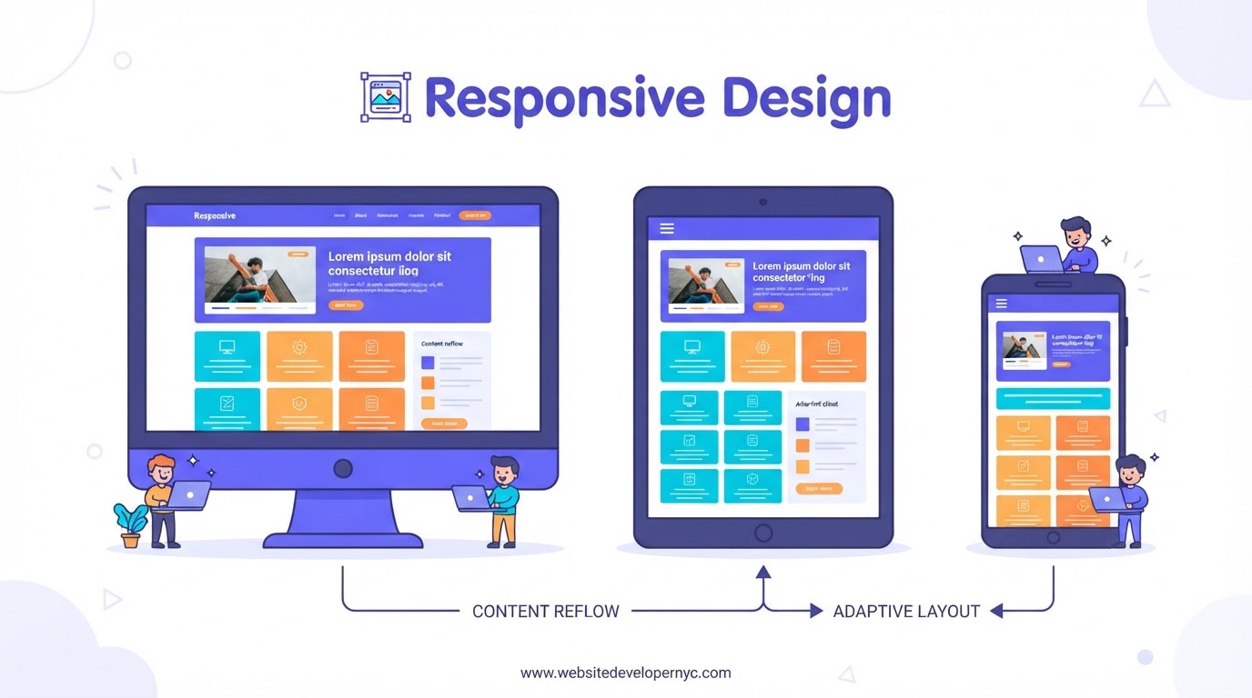
SITEBOW has built responsive websites for NYC businesses for over 20 years, and every site we design today is mobile-first by default. Responsive design means a single website that adapts its layout, typography, and interactions to the screen it is viewed on, from a small phone on the subway to a large desktop monitor in an office.
The alternative, separate mobile and desktop sites, is outdated and creates maintenance and SEO problems. A well-built responsive site serves the same content and URLs to all devices, which is better for users and better for search engines.
Our responsive design process starts with the mobile experience, where most NYC visitors arrive, and scales up to larger screens. We optimize tap targets for fingers, legibility for small screens, and performance for cellular connections.
We test across devices, browsers, and screen sizes before launch so nothing breaks in the real world. Because responsive design affects SEO directly through mobile-friendliness and Core Web Vitals, our responsive builds help your site rank as well as convert.
Why responsive design matters for NYC businesses
Responsive design directly affects how customers find, use, and trust your website, and the effects show up in traffic, rankings, and revenue.
Mobile is the majority
Most NYC search traffic is mobile. A site that works poorly on phones frustrates the majority of your visitors and sends them to competitors, often within seconds and often permanently. New Yorkers browse on subways, sidewalks, and in elevators, on screens of every size and connections of every speed. A responsive site handles all of it gracefully, and that gracefulness is what keeps visitors on the page long enough to become customers.
Google is mobile-first
Google indexes the mobile version of your site first. A responsive, mobile-optimized site is a prerequisite for ranking in local NYC search, not a bonus. If your mobile pages are broken or slow, your rankings suffer even for searches performed on desktops. Responsive design removes that entire category of risk by serving one well-built experience to every device.
- Mobile-first indexing by Google
- Responsive sites rank better
- Prerequisite for local NYC search
Trust and conversions
A broken mobile experience signals an outdated or untrustworthy business. A smooth responsive experience builds confidence and converts. Customers judge whether to call you partly on how professional your site feels on their phone, and a site that breaks on mobile tells them the business behind it may be equally neglected. The reverse signal is just as powerful.
Our responsive design process
We design and test responsively from the start, not as an afterthought bolted on at the end of a desktop-first project.
Mobile-first design
We design the mobile layout first and scale up. This forces focus on the most important content and actions, because a small screen forgives nothing. When the mobile design works, the desktop version inherits that clarity rather than diluting it. Designing in the other direction almost always produces a desktop site that crumbles when compressed onto a phone.
Cross-device testing
We test every site across phones, tablets, and desktops, and across browsers, so layouts hold up in the real world. Emulators catch some issues but not all of them, so we verify on actual hardware where the differences live. The goal is simple: no visitor, on any device, ever sees a broken version of your business.
- Phones, tablets, and desktops tested
- Multiple browsers covered
- No broken screens at launch
Performance tuning
Responsive design must also be fast design. We optimize images, code, and loading so mobile pages stay quick even on cellular connections. A layout that adapts beautifully but takes six seconds to arrive is still a failed mobile experience. We treat speed and adaptability as one requirement, not two.
Responsive design and Core Web Vitals
Google measures real-world page performance and rewards it. Responsive design is the foundation those measurements sit on.
What Core Web Vitals measure
Core Web Vitals measure loading, interactivity, and visual stability as actual users experience them, mostly on mobile. Responsive builds that control layout shifts, keep tap targets comfortable, and load efficiently score well. These scores influence ranking, especially in competitive local markets where every signal counts.
How we hit the targets
We set performance budgets at the start of every project and verify against them before launch. Image sizing, font loading, and script weight are all design decisions, not afterthoughts. Because our designers and developers work together, we never ship a beautiful design that fails its performance budget.
- Performance budgets set upfront
- Verified before launch
- Layout shifts eliminated
Making an existing site responsive
If your current site predates responsive design, we can bring it forward without starting from zero.
Retrofit or rebuild
We assess whether your existing site can be retrofitted with responsive layouts or whether a rebuild is the better investment. Younger sites on maintainable platforms often retrofit well. Older sites on obsolete foundations usually cost more to patch than to replace, and we tell you honestly which situation you are in.
Protecting what you have
Whether retrofitting or rebuilding, we preserve your content, URLs, and search equity during the transition. Making a site responsive should improve its performance, not reset it. We plan the migration so rankings survive and the mobile experience arrives better than the desktop one it replaces.
Responsive Design FAQ
What is the difference between responsive and mobile-friendly?+
A mobile-friendly site works on mobile, while a responsive site adapts smoothly to any screen size. Responsive design is the modern standard and is better for SEO and user experience.
Will my responsive site rank better?+
Responsive, fast, mobile-optimized sites have a clear SEO advantage because Google uses mobile-first indexing and rewards Core Web Vitals performance.
Do you make existing sites responsive?+
Yes. We can rebuild or retrofit existing non-responsive sites to be fully responsive and mobile-optimized.
Does responsive design cost more?+
Responsive design is the standard way we build, not a premium add-on. Every SITEBOW site is responsive by default, and we design mobile-first from the beginning.
Other Website Development Services
Website Development
Custom, conversion-focused websites built for New York City businesses.
Web Design
Beautiful, conversion-driven web design for New York City brands.
Custom Development
Hand-coded, scalable custom websites built to your exact specifications.
E-commerce
Online stores built to sell, scale, and rank in NYC.
WordPress
Custom WordPress development that is fast, secure, and easy to manage.
Shopify
Custom Shopify stores built to sell in the NYC market.
Website Redesign
Transform an outdated site into a modern, high-performing asset.
SEO Services
Rank higher and attract more local NYC customers.
Local SEO
Win the map pack and neighborhood searches across all five boroughs.
Maintenance
Keep your site fast, secure, and up to date with ongoing care.
Hosting
Fast, secure, reliable hosting tuned for NYC performance.
Web Apps
Custom web applications that solve real business problems.
Landing Pages
High-converting landing pages built to turn clicks into customers.
UI UX Design
Interfaces designed around how real people actually use them.
Speed Optimization
Make your site faster to improve rankings and conversions.
Security
Protect your website, your data, and your customers.
CMS Development
Empower your team to manage content without a developer.
Consulting
Expert guidance to plan a website that actually performs.
Website Migration
Move your site without losing traffic or search rankings.
Branding & Logo
Brand identity and logos that make your NYC business memorable.
CRO
Turn more of your existing traffic into customers.
Smart Websites
Intelligent, automated websites that adapt to every visitor.
Chatbot AI
AI chat assistants that answer, qualify, and book around the clock.
Voice AI
AI phone answering that books appointments for NYC businesses.
Serving Responsive Design across NYC's five boroughs
Responsive Design in popular NYC neighborhoods
We deliver responsive design for businesses in neighborhoods across all five boroughs. Each area has its own locally optimized page.
Ready to build a website that ranks and converts?
Get a free, no-obligation proposal from SITEBOW. 20+ years of NYC website developer experience, working for your business.